A robust web portal for the conversational AI serving the finance industry
Working as a UI developer isn't just about taking designs and materializing them. As one advances in their career, it's often expected to be familiar with different UI design patterns and to be able to contribute to the evolution of designs along with the product and design teams. I covered a lot of ground at Kasisto during my time there. Most of it was spent rearchitecting the project and creating a custom component library, but there was one instance where my design experience in particular directly led to the resolution of a troubling UX problem.
Wrong Tool For The Job
Without getting too much into the business logic, this feature was highly trafficked and vital when it came to configuring how and when a conversational model would deliver a response to particular user queries. These responses where configured using a list of accordion UI elements where each accordion featured a series of potential responses linked to a particular query type.
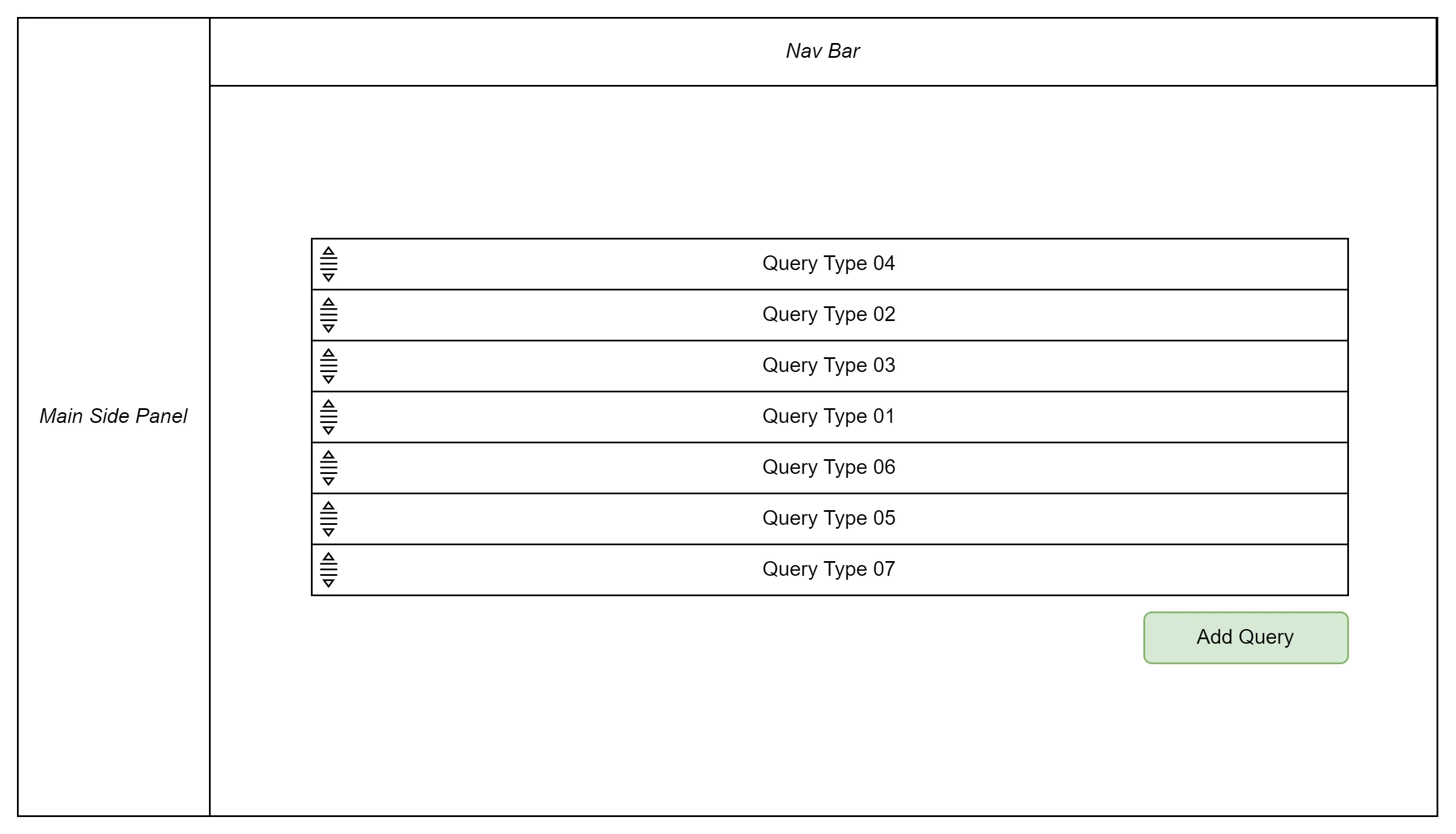
A mockup of the original feature's design. Aside from a title and description above the list, the feature looked very close to this representation.
The contents of each accordion however, featured a conditional form that could be used to add one or more responses for that particular query. With many different response types, the accordion could quickly fill up with multiple viewports worth of content. Not to mention there was no limit on the number of query types. So not only could the accordion list grow quite long, but the contents of each could also get even longer.
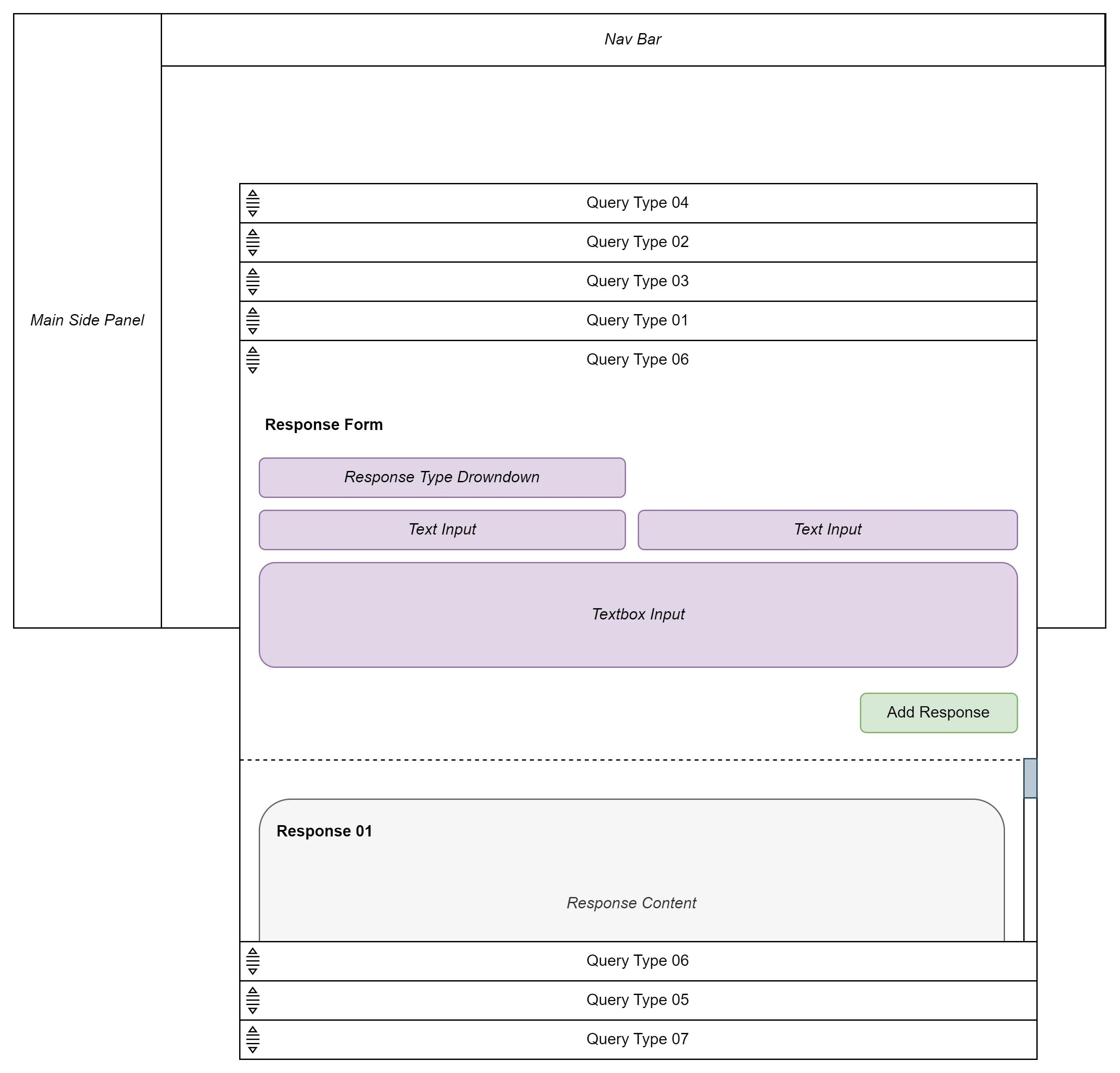
Observe just how much content could fit in a single accordion. The workspace is cluttered and cumbersome especially when working between queries.
What made this problem particularly acute was that, not only were the accordions reorderable but their responses within them were too! You can imagine how cumbersome and frustrating it would be to work between multiple different accordions.
Designing With Heads Down
In addition to all of the rearchitecting going on with the web portal, a design team had audited the application and was working to deploy a new design system with vital features getting the first treatment. While there were some UX improvements throughout, it was all mostly a fresh coat of paint. The product and design team couldn't ignore the problem with this response page however and was working to make the experience more intuitive. Unfortunately, both product and design teams became too fixated on the existing accordion pattern and instead of considering different UI components altogether were simply exploring ways to reinvent and improve the accordion pattern.
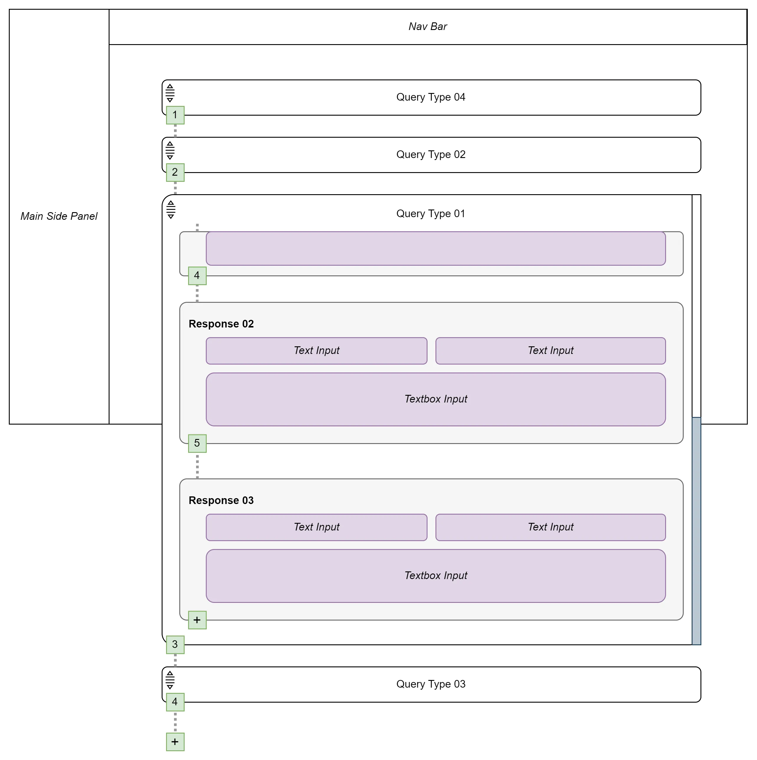
Observe how the accordions and corresponding content simply look rounded and less generic. One improvement that was welcome was removing a creation form and instead making the response content editable all the time.
If you've ever worked with drag and drop elements in a UI you'll know that it has its limitation when moving beyond the fold. Given how many viewports worth of content there could be for any particular query type, direct manipulation of these accordions (or the responses within them) could involve dragging content vertically for an unreasonable amount of time. The design teams solution to this was to eliminate this feature and have it be controlled by anchor points that showed the position of the response and a drop down of positions to reorder to...
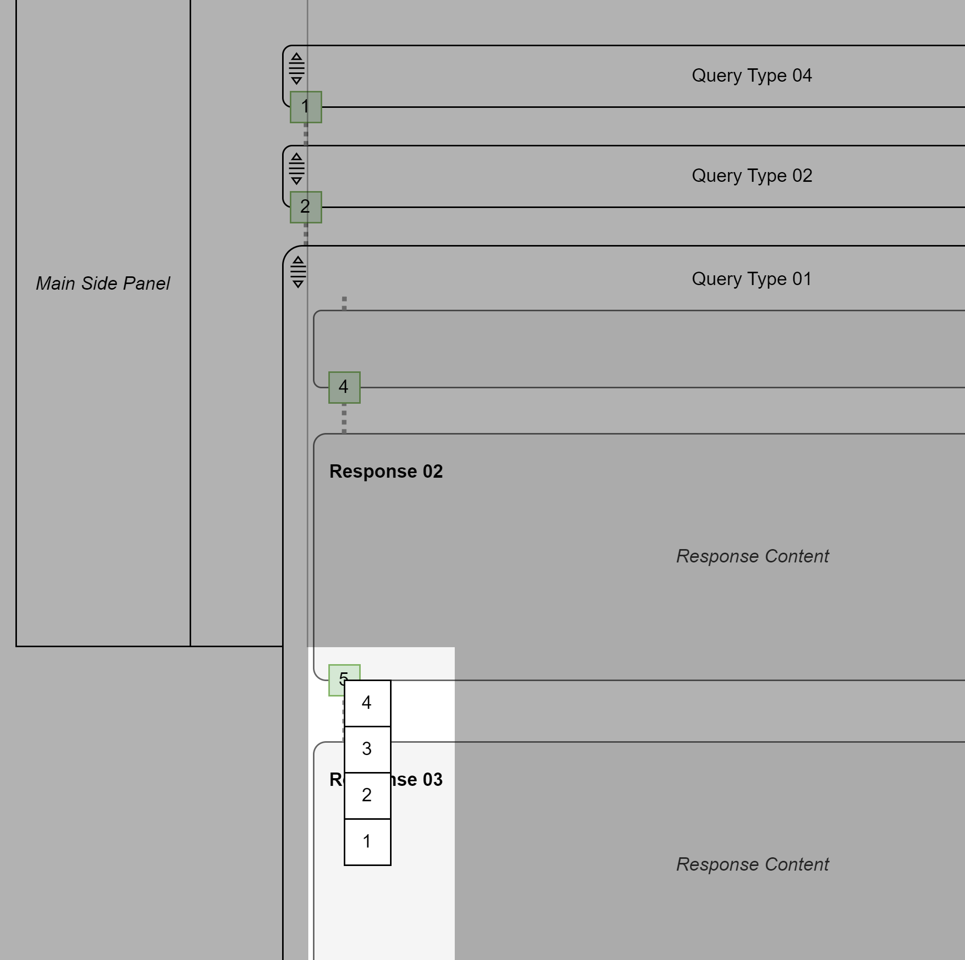
Observe how when an existing anchor point is selected, a list of alternative positions can be selected.
Mind you that the reordering applied to both the query types (accordion items) and the content within them (responses). So this anchor-dropdown feature was present on two levels! On top of this, vertical lines were added to connect the anchor points to help a user differentiate between elements and levels. The feature began to smell of overengineering.
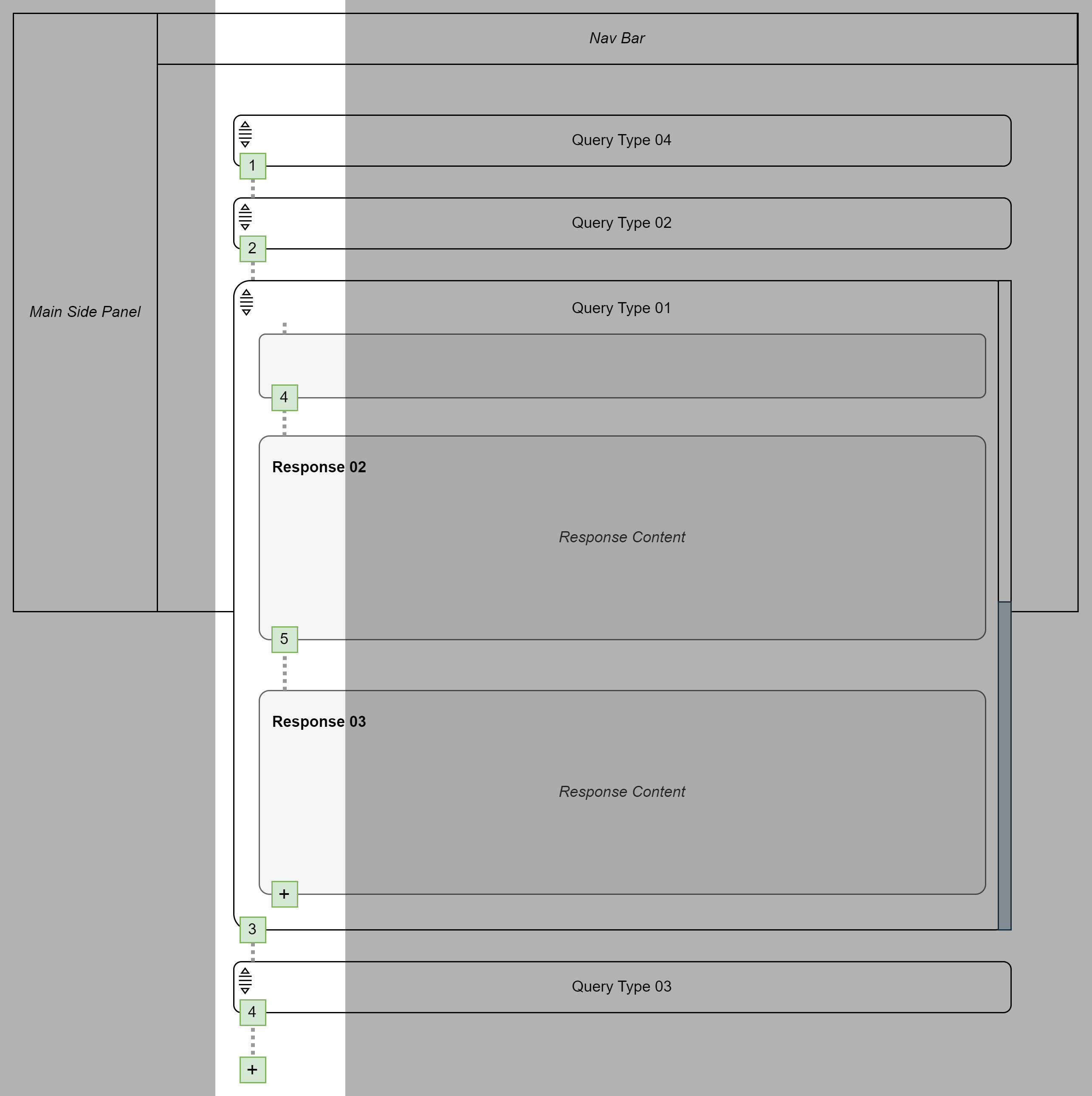
Anchor lines present for query types and responses to help with the visually awkward design.
As a developer, I was beginning to get a lot of anxiety looking at this -- aside from the design not really feeling like a genuine improvement in terms of UX, it was looking to be a convoluted and costly implementation.
Taking a Step Back
After some time trying to make the new design work, I expressed to the team that I wasn't feeling confident in the design and was going to explore an alternative myself.
I took a look at my previous role at Hubcap where I faced a lot of design challenges as well. The bulk of the development work I did there was for a vendor side web portal that featured a car wash menu creation page. I went through several iterations of designing this page and faced similar UX issues. In this instance, we were trying render a series of menus alongside a form used to create/edit them.
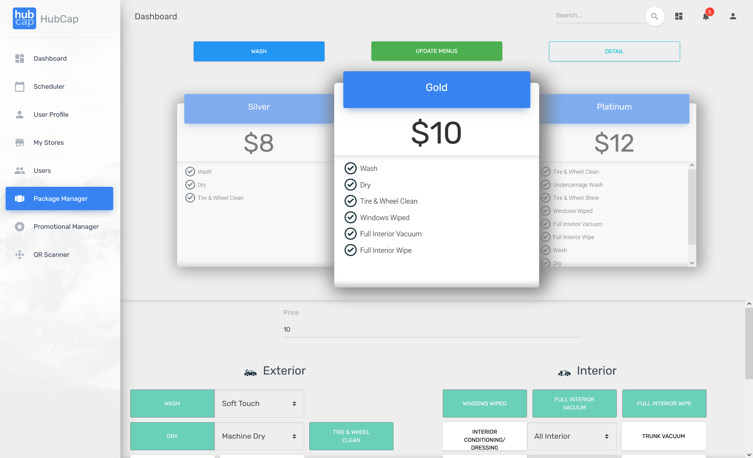
Observe how all the menus are present at once and how the form below is within a box only about a 3rd of the viewport.
Regardless of my efforts, I just couldn't find a design that wasn't a compromise to either the form or menus. Similar to my team at Kasisto, I was transfixed on accommodating this design. I took a break for a day or two and when I came back to it, had an epiphany -- I don't need to render all of these menus at once. In fact, there really wasn't even a point in rendering a polished looking menu at all.
After another day of considering an alternative, I landed on a far more intuitive design that was more scaleable -- abstracting the subject and content to a side panel and rendering the form to the right of it. This opened up so much screen real estate to the user and made working through the form far more comfortable.
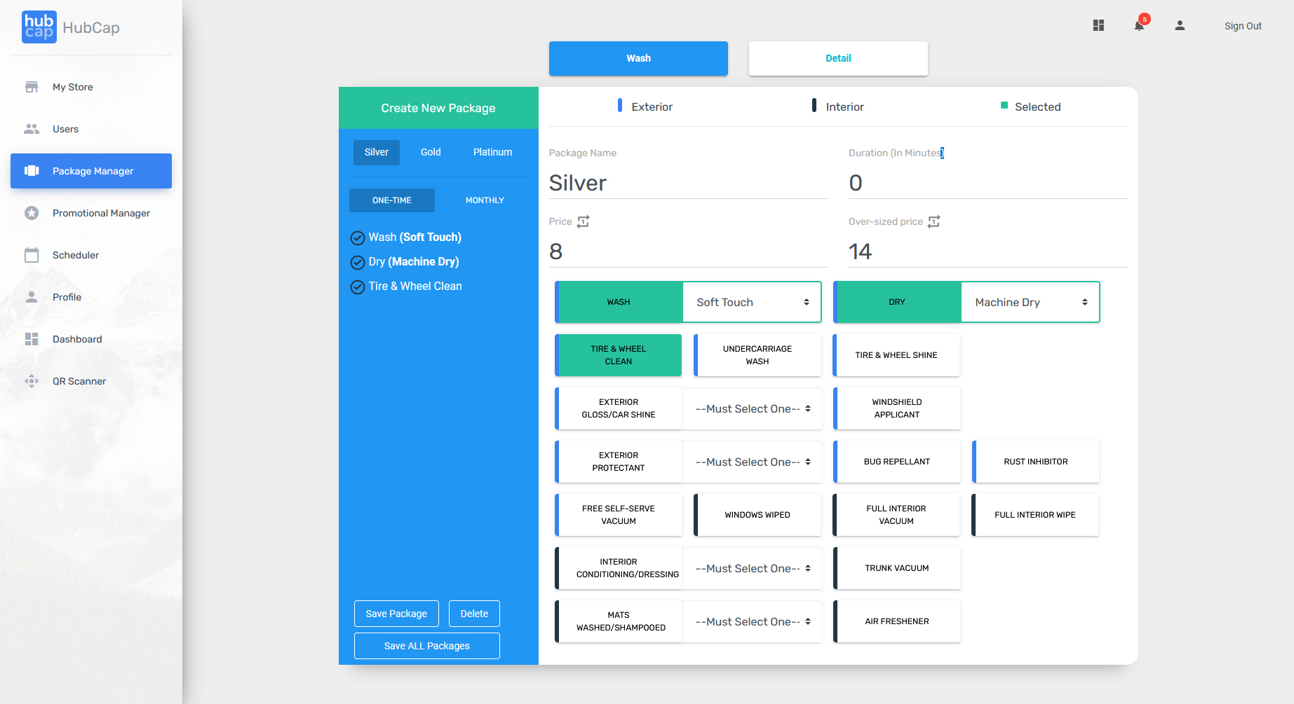
Observe how only the selected menu's content is displayed. This format also allowed for the introduction of "One Time/Monthly" options and a color key without sacrificing any screen real estate. It could even be scaled horizontally if necessary.
A Fresh Perspective
After considering what I had learned from my previous work at Hubcap, I took some time to see how I could adapt the design to the Kasisto work. The thought was to take the query types and abstract them to a side panel. From there, selecting any particular query type would load the related content beside it. Recall that reordering these query types and their respective responses was also a requirement. Not only could responses be represented in a nested tree list within the side panel, but the reordering could take place there as well. The result was a far cleaner UI that was much easier to reason about.
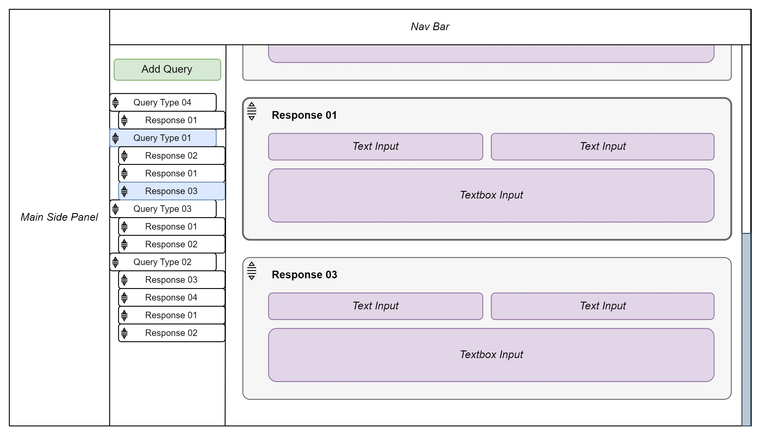
Observe how much better utilized the space is. A typical tree view is rendered to the left as an abstraction of the actual content. This layout added the ability to quickly focus on responses too.
In order to sell this I had to present it to the team with more than just words. I happened to be working in a popular documentation tool at the time and to my surprise, the UI was basically what I was aiming for -- nested document titles in the left side panel and the content of the page that was selected in the main body beside it. The documents were even reorderable! I decided to mock up a dataset we had in this tool along with some cropped screenshots from the UI designs. I pitched it to the team very similarly as I did here -- recalled Hubcap experience and resolution and then solidified it with a crude reproduction using a tool that also utilized this UX pattern. By the end of the next day, the design team had produced some new designs and all of the awkwardness had been thwarted.
Come implementation time I had a much better idea of how to go about it and it proved to be far simpler. Aside from getting positive recognition from the greater team and company, initial customer feedback for the redesign was very positive with an emphasis on improvements to this feature.
This anecdote feels like such a classic example of 'thinking outside the box' or 'taking a step back'. Some times you just need to pick your head up, take a breather, and come back to the problem with a clear mind. While I earned another experience under my belt, the best part was that the outcome was overwhelming positive -- designers felt more confident and could put their efforts elsewhere, I had a much better time implementing the feature, and users were much less frustrated.