A non-profit organization that aids pregnant women in remote, marginalized communities.
Mimsi reached out to me to design and create a new pitch deck for their non-profit organization. Their vision was to abandon the traditional slide format in favor of a more seamless experience that favored continuous scrolling and custom animations. The result is a more immersive and illustrative experience on their accomplishments and plans for the future.
Finding The Right Format
Unlike the traditional slide formats that one might produce in PowerPoint or Keynote, the design was intended to be continuous and compelling. More modern presentation software like Prezi, SlideBean, and the likes offered fun, interactive alternatives to the traditional style, but they were quite limited when it came to customizing the core transition mechanics and might require hacky solutions to achieve an intended design.
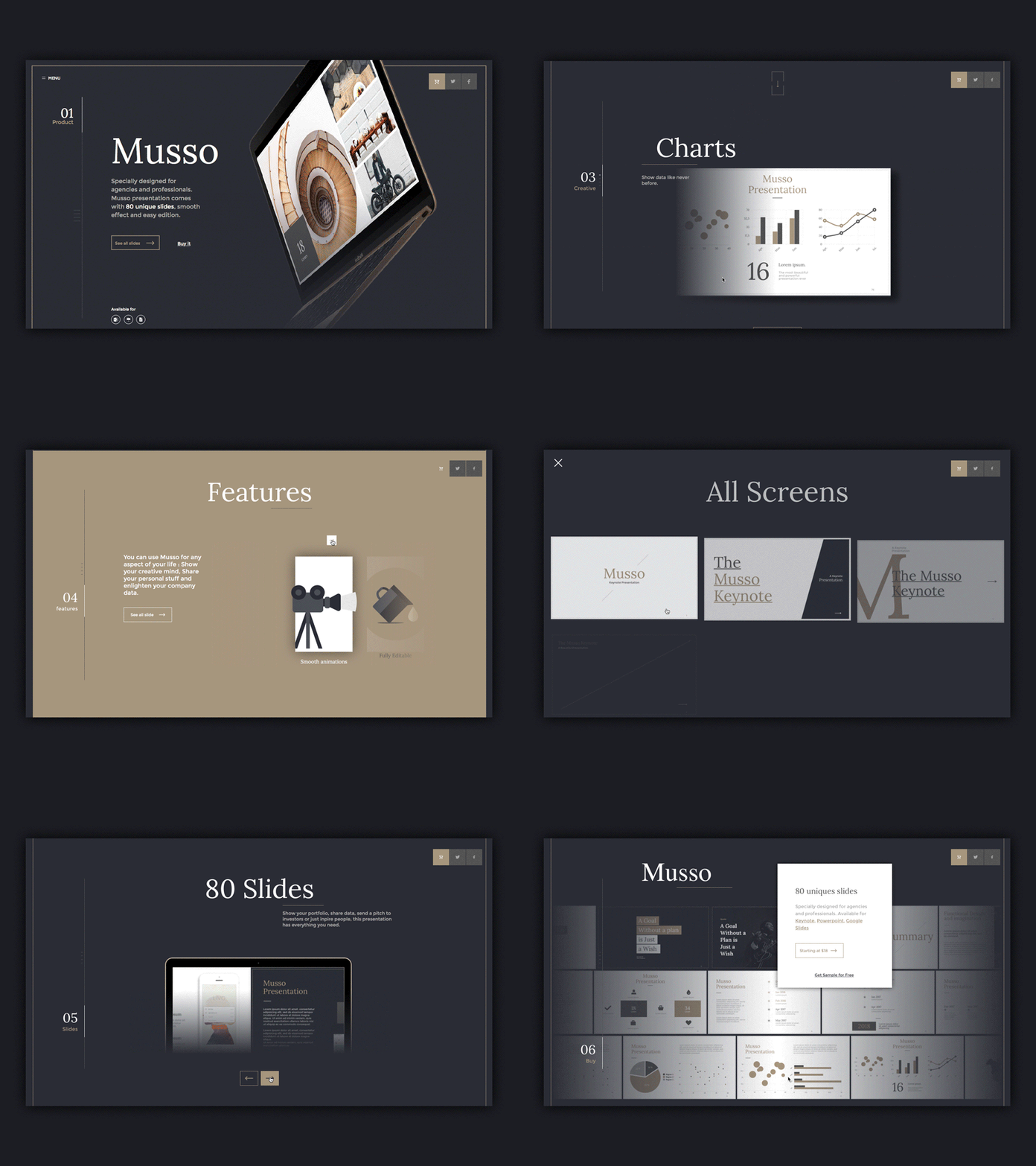
An example of a sleek, modern presentation format. This was a rather feature rich template and came close to what the client was looking for. Unfortunately, much would still need to be modified and custom animations and transition effects posed a real problem.
Eventually I determined that this unique format, paired with custom illustrations and transition effects, was not achievable with typical presentation software. As a web developer, I don’t think it was surprising when I decided to develop it as a web document using purely HTML, CSS, and Javascript. This allowed for much more freedom not only in terms of design, but development as well. Specifications that might be difficult or even impossible to implement in traditional software could now be solved using Javascript or CSS. A web document also offered the ability to integrate into a website and operate on all devices responsively.
The Intersection Observer
In order to keep the web document small and robust I wanted to avoid any code libraries. In my pursuit of this I stumbled upon a relatively new feature to Javascript called the Intersection Observer. This feature provided a native way to track elements on the screen and apply logic when they cross certain thresholds. It also achieved this without a taxing event handler that is fired on every frame. The result is what you'd expect, but in a much more efficient way.
The text box is clearly the target element and triggers an animation when it either enters or exits the viewport.
Designing The Right Format
What was important to consider when I was designing the new format was how the key sections would be distinguished. Pitch decks can typically be broken down into several sections (vision statement, solution, business model, financial plan, call to action, etc.). These broader sections might be further expanded on with subsections.
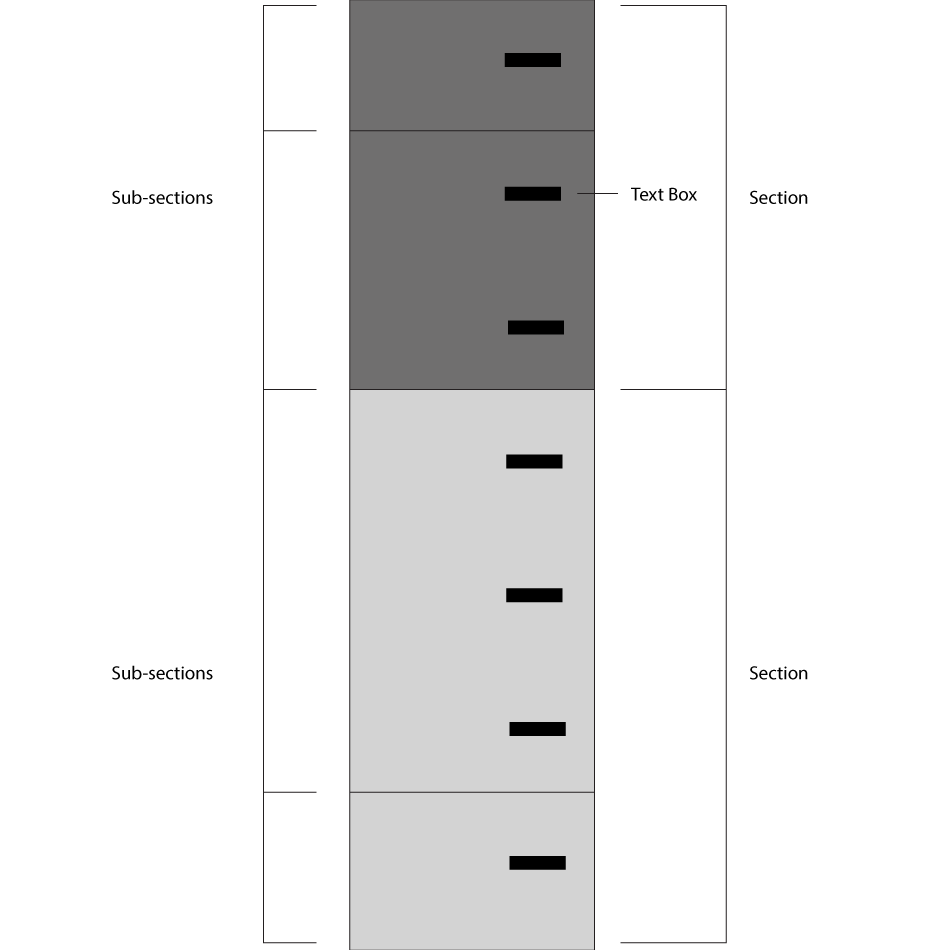
The diagram shows how broad sections are broken up into subsections. The text boxes supply information on their respective subject.
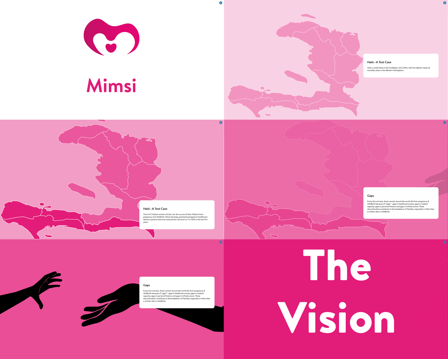
While the diagram very clearly illustrates the separation of subject matter, the actual implementation was not to contain anything so definitive. Header titles on the text boxes helped distinguish the subsections, but the broader sections needed to be distinguished in a more subtle manner. I decided to illustrate this by temporarily breaking from the scrolling text box format and instead replace it with large, bold text. The title was further emphasized by a solid, colored background and progression through these broader subjects was done using gradients.
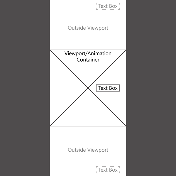
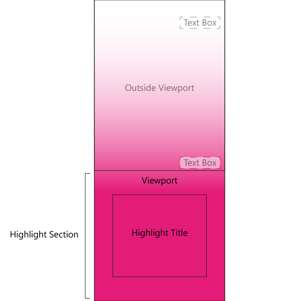
Left: The diagram illustrates how content is viewed. The viewport houses the animation container which remains fixed. As a user scrolls, only the text boxes scroll. Right: Key subjects, called Highlight Sections, were built up using color gradients and emphasized using a solid color and large, centered text.
What it all looks like put together...
Transition Effects and Vector Illustrations
In presentations, illustrations are often used to supplement or create an association to an idea that has been introduced from text. The same applies to the Mimsi pitch deck only we wanted to depict the ideas introduced using animated vector art. This style complimented the format, remained simple enough to not steal too much attention, and helped illustrate certain ideas better.
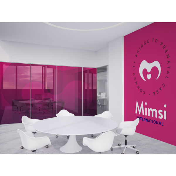
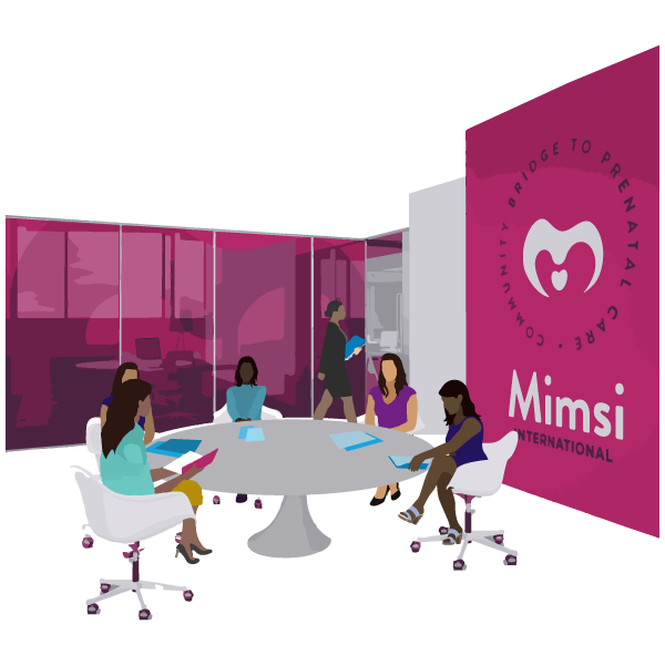
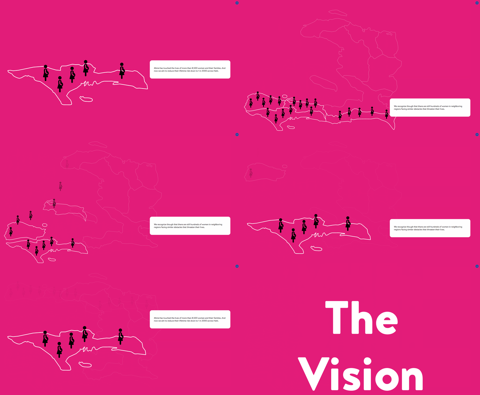
A render (left) supplied by the client was used as the foundation for a vector illustration (right) that incorporated more elements.

The finished product demonstrates how vector illustrations can be broken up and animated.
One of the primary advantages of using the web format was that it provided limitless flexibility when it came to animating illustrations. I was able to get very particular about what elements I wanted to target and was able to produce exactly what the client was imagining.

One of the more complicated animations required 'dropping in' icons and rearranging them into orderly lines alongside a bus in their respective regions. It's harder than it looks...
One of a Kind
By the end of the project I was very happy with the decision to create the pitch deck as a web document. It was portable, easy to integrate, responsive, and most importantly the client got exactly what they wanted.
You can take a look at the full pitch deck here.
Mimsi is doing incredible work in Haiti and soon across the world with their program. The mission is led by Dr. Winfred Tovar., a medical doctor whose family hails from Haiti. The goal is to ensure the safe passage for woman from pregnancy through childbirth and into motherhood. By utilizing mobile technology and high impact training, Mimsi is able to change entire communities for the better and in only the course of a few weeks.
Update: It pains me to say it, but unfortunately due to the pandemic Mimsi's operation came to a halt in April of 2020 and the organization has remained inactive since.