A portfolio website to showcase projects and photography
When I had come up with the concept for this project years ago, it was intended to solely be a photography website. The design was incredibly minimal and was to be less about me and why I enjoy photography and more about the images themselves. Once development for the website began in February of 2016, I realized that the website would be better suited as a general portfolio website rather than something so specific. Sticking with the theme of the initial design, my goal was to avoid the common daily blogger design and instead implement an experimental, minimalist design that evoked a sense of exploration.
Initial Design
Because I didn’t want this to be a traditional website, I didn’t consider any traditional elements. If anything, I wanted the user to scratch their head and get a little curious.
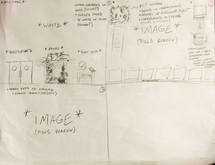
I eventually decided that the albums should feel as though they are places and can be ‘entered’ like doorways. This is exactly what I ended doing. The doors would appear in a blank white space and feel as if they were alive; Birds come and go from a nature album, servers occasionally pop in and out of a kitchen album, water breaks at the shore of a beach album, etc. It was ambitious for someone with no web development experience, but I wanted the user to feel as though they were actually entering a space and not just clicking a link.
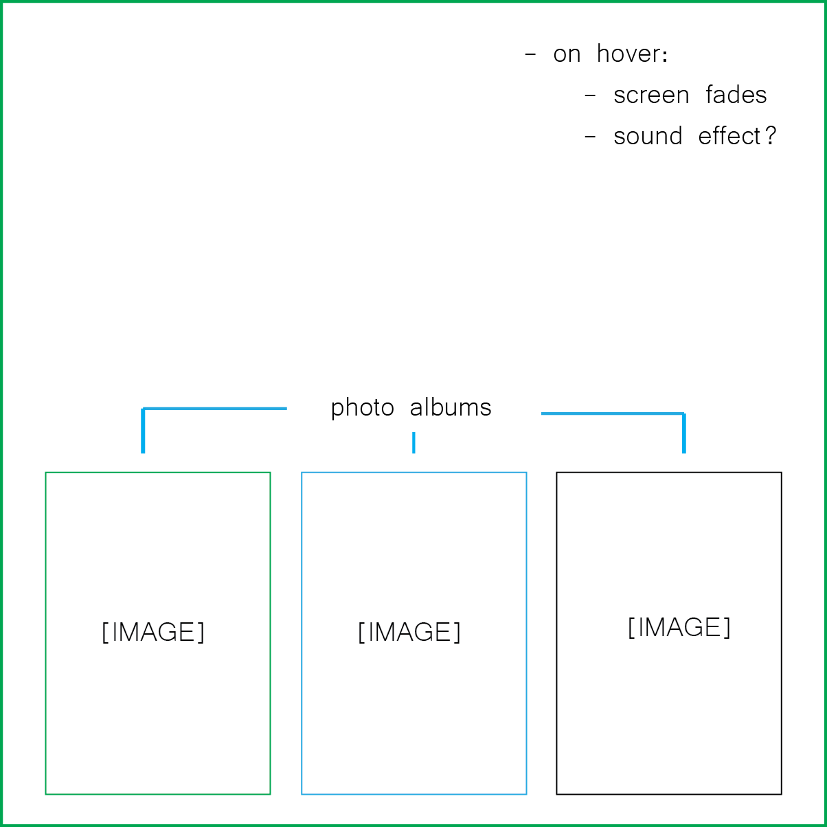
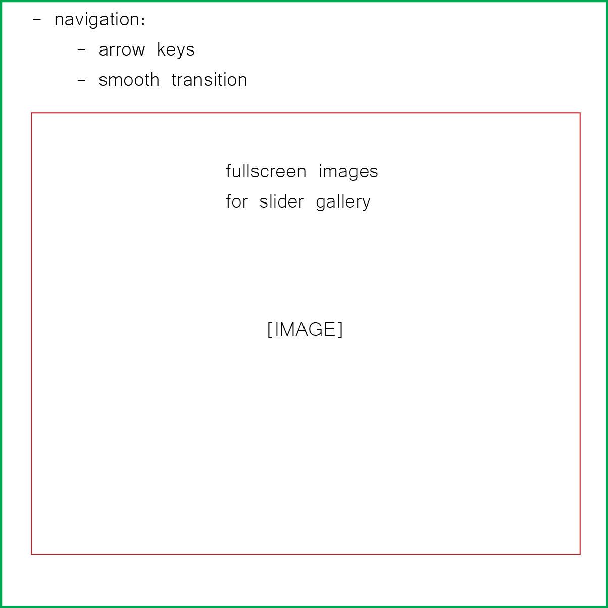
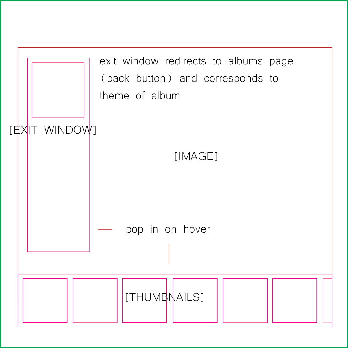
Upon entering the album, a user would be presented with a full screen gallery with no menus or visible buttons. Moving the mouse however, would reveal a slider and back button disguised as a smaller doorway. What I liked about this design is that I could keep building onto it. Perhaps as I accumulated more pictures related to a particular album, the doors would begin to become a part of a greater scene that could be further interacted with. Unfortunately, I didn't have the know how to do all of this and a lot of the flare was stripped from the design.
Resume Design
After realizing how ambitious I was with the first design, I decided to take a step back. The idea was to keep the minimal design but extend the site's purpose. This was done with large button icons that would lead to other sub-pages of the site including a "games" and "photography" section.
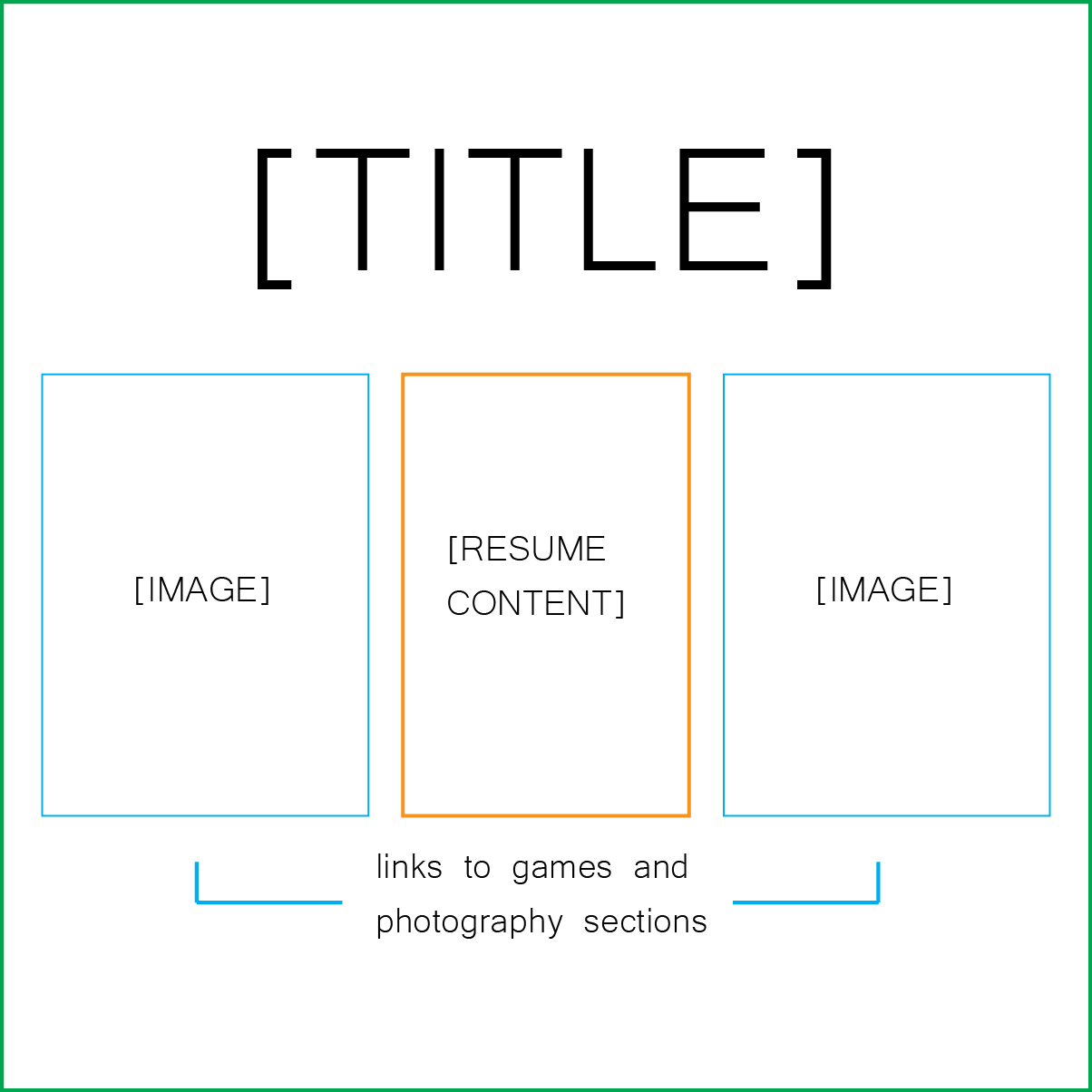
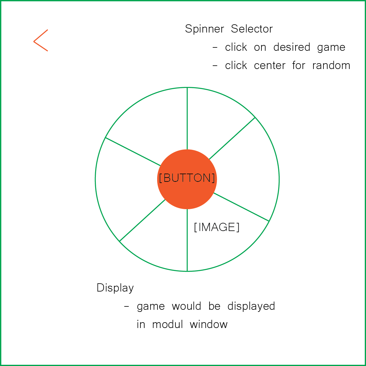
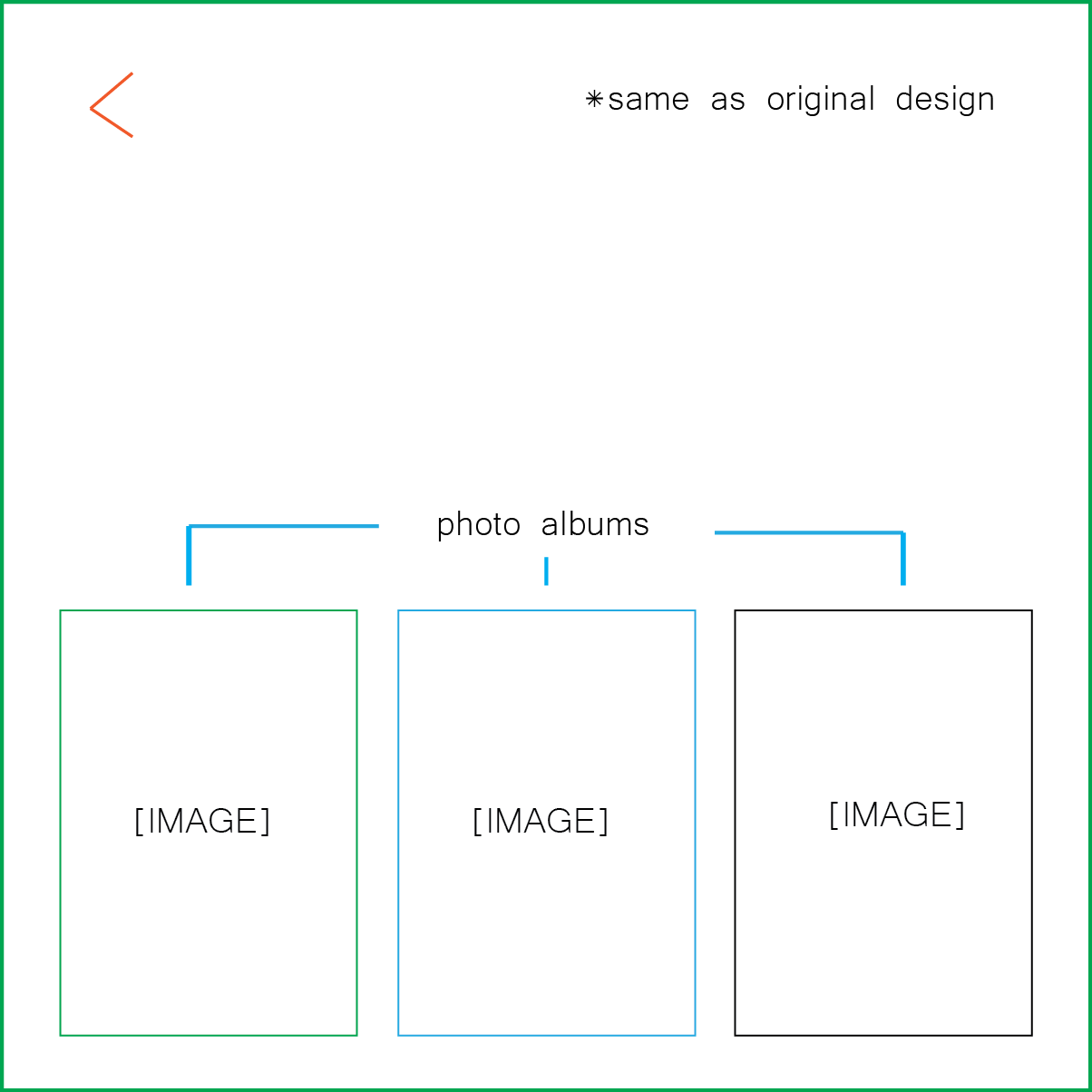
The "games" section featured a spinning wheel that, when clicked, would randomly select a game and display it in a pop-out window. The "photography" section adopted the initial site design and featured a series of themed doorways that led to different photo albums. The middle section would essentially be a more verbose resume, featuring an about-me paragraph, skill-list, a few sentences on interests, and contact info.
Node Design
Eventually, I found that the resume design wasn't really looking or feeling like a modern day site. I went to the internet for help, found a few examples of what I liked, and landed on a top-to-bottom node design. It retained the minimal aspect I wanted and would remain sleek without requiring too much styling or script.

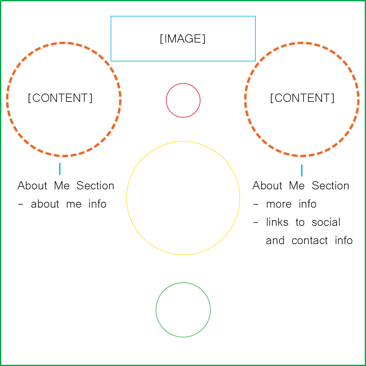
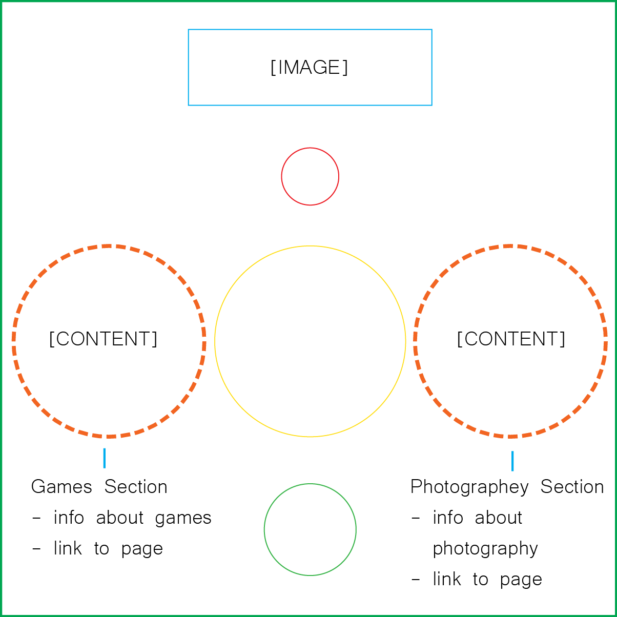
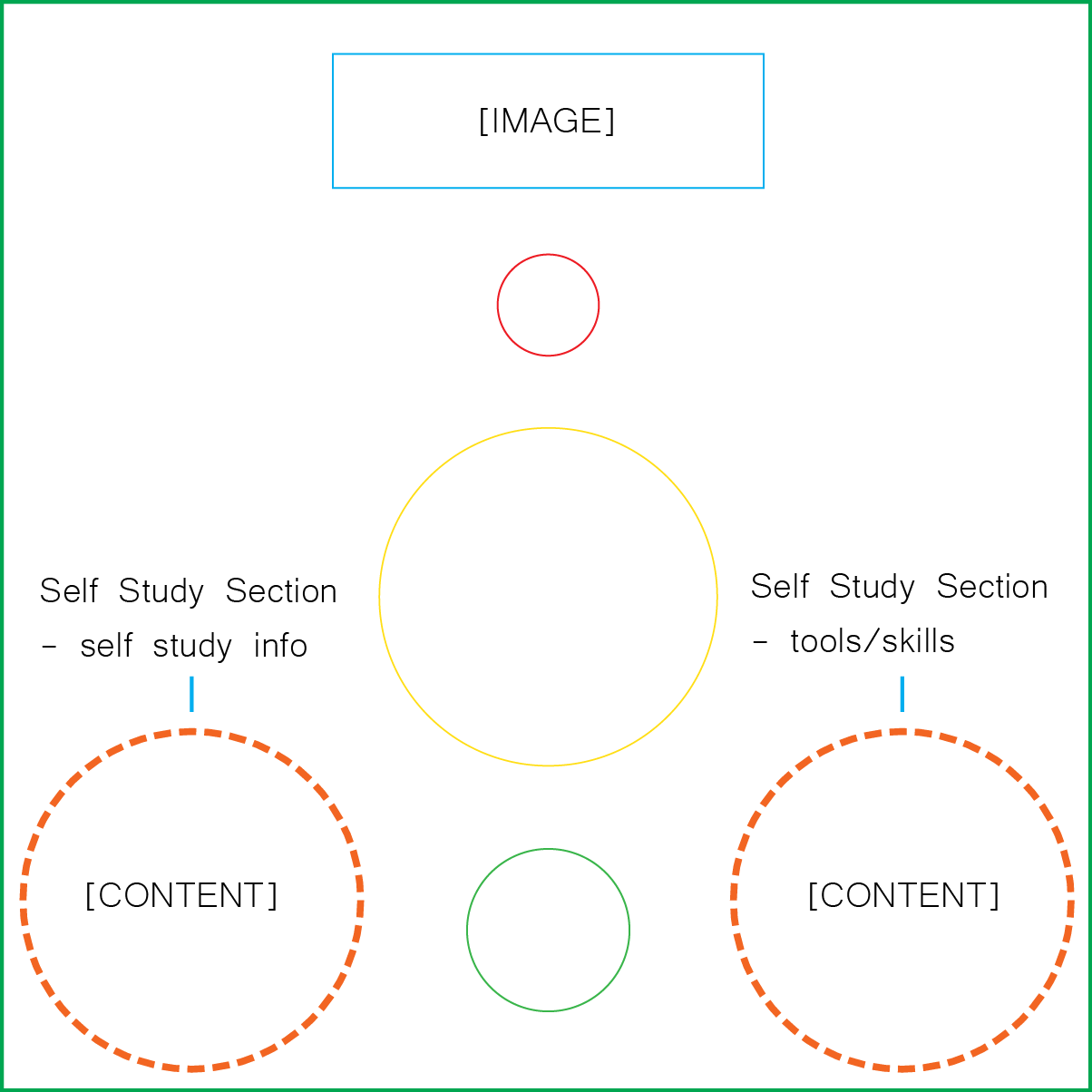
The nodes were to be different colors and labeled. When clicked, two larger circles would fade in to the left and right of the selected node. This would include a brief introduction to the section along with a link to a more in depth sub-page or contact info. After I had the basic layout made, I started to realize that the circular nature of the nodes limited the amount of text and formatting possibilities and I later abandoned the concept.
Expanding Block Design
The expanding section design was by far my most uninspired design. It was actually a second attempt at incorporating more elaborate animation schemes (something I was getting too caught up in).
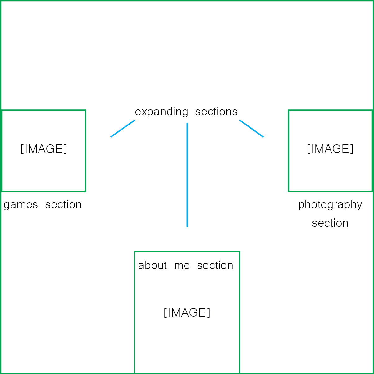
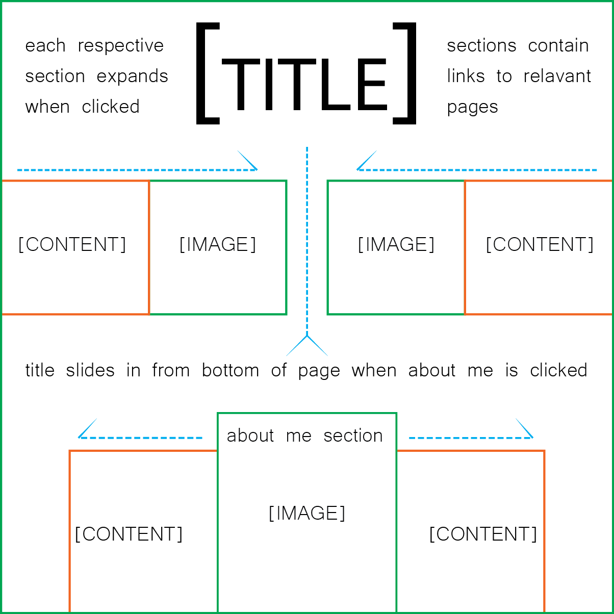
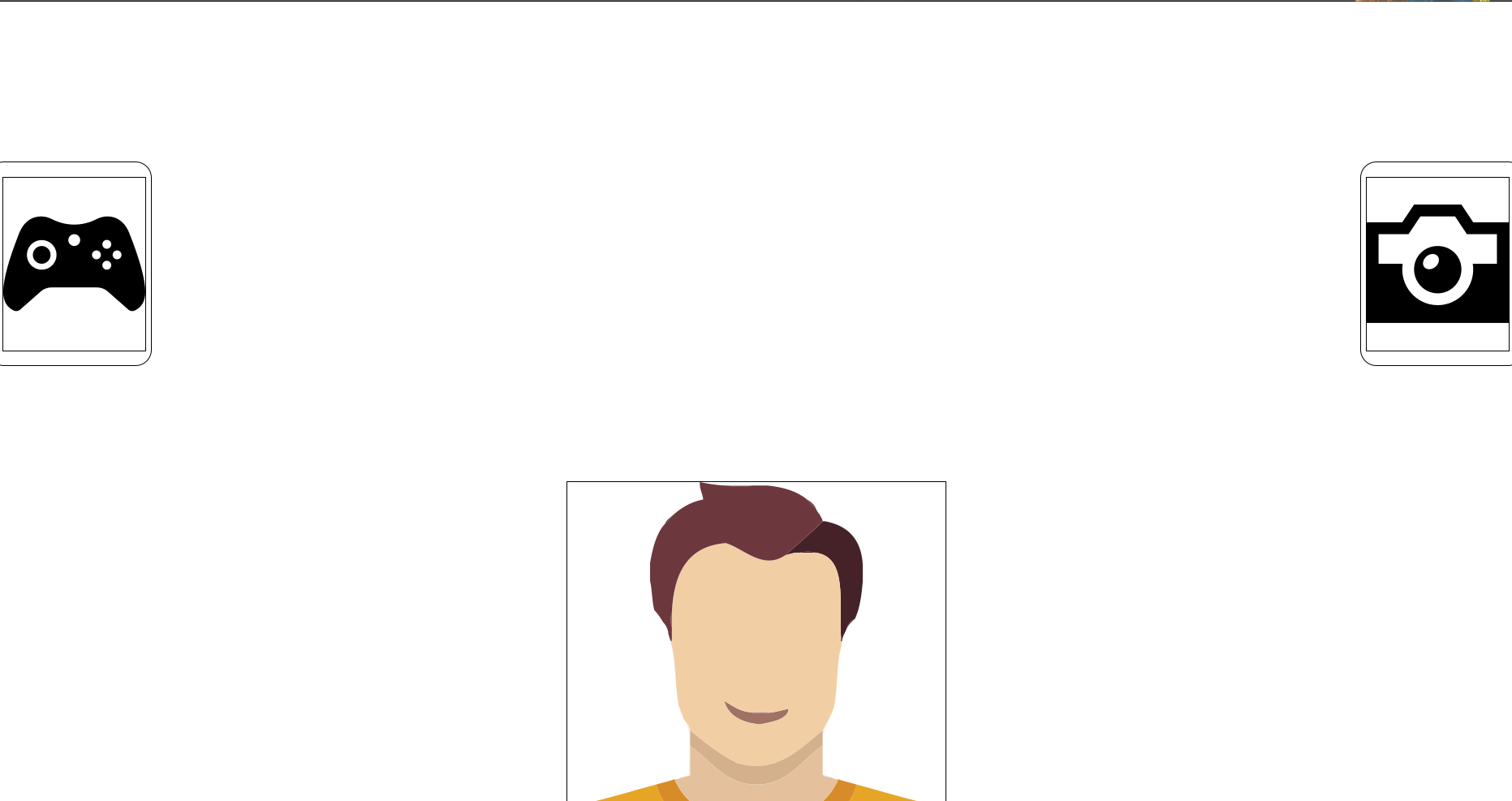
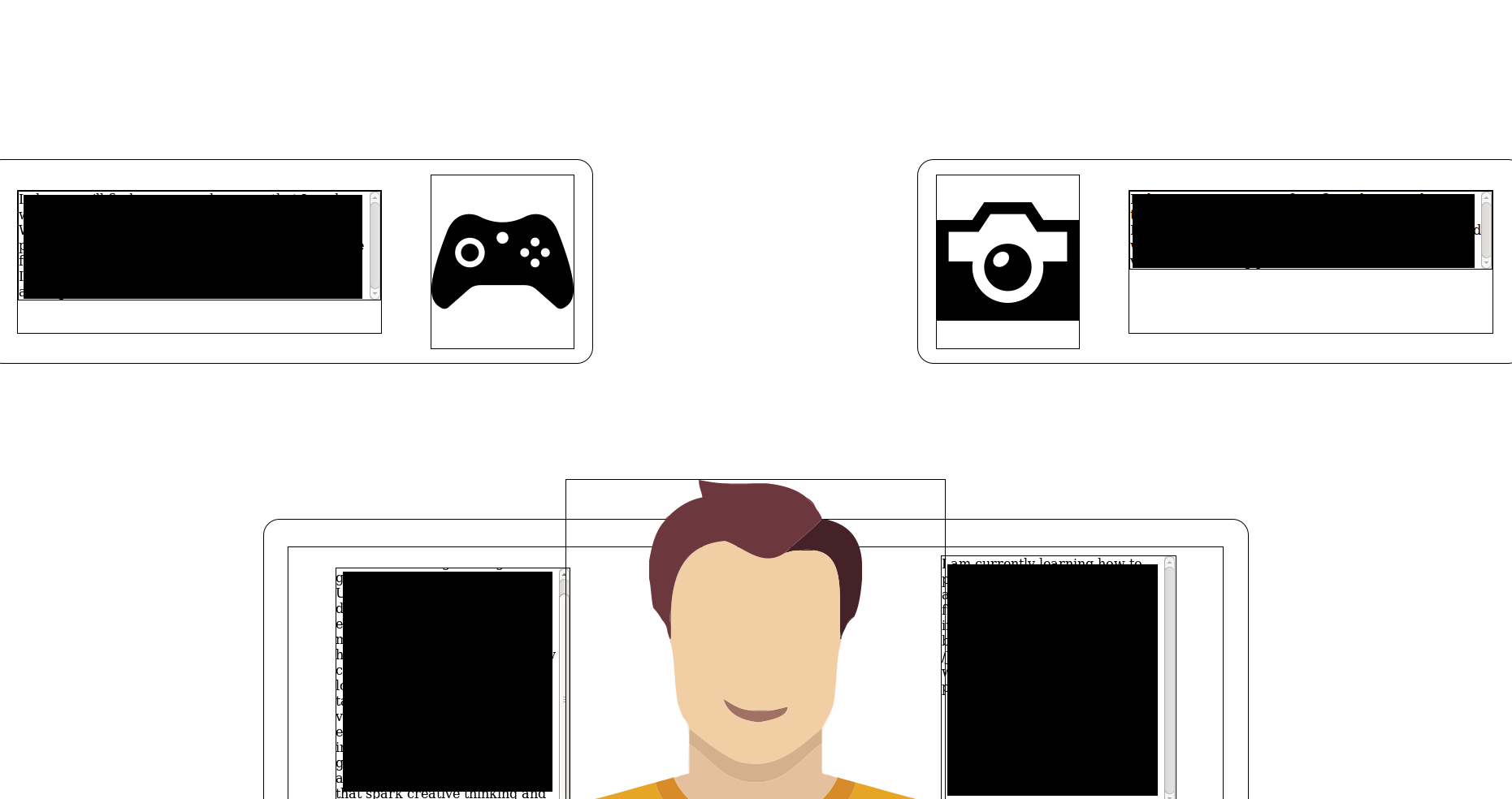
The design consisted of 3 blocks with icons instead of labels and rather than fade in like the nodes, they would slide in. The layout in the contracted state was absolutely uninteresting however, and didn't really provoke a user like I had thought it would.
Expanding Node Design
For the new design, I decided that everything would go on one page. It would include and About Me section consisting of a few paragraphs and relevant social media links, a games section with a new grid layout, a tools section that featured a table of all the latest tools and technologies I'm using, and a photography section which hadn’t changed.
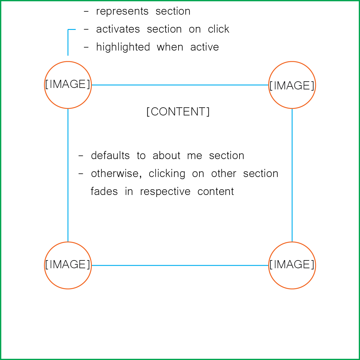
I started the expanding node design with a 'window frame' design where buttons corresponding to each section were located at the corners of the frame. Similar to the original node design, the buttons would fade in the respective content when clicked, the default being the About Me section.
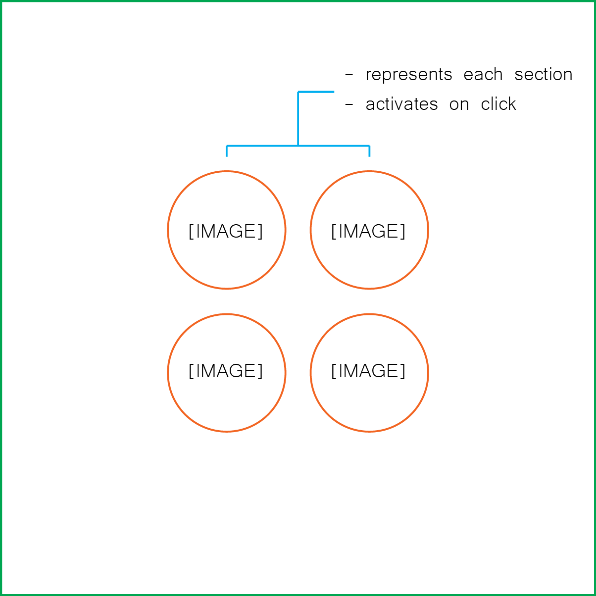
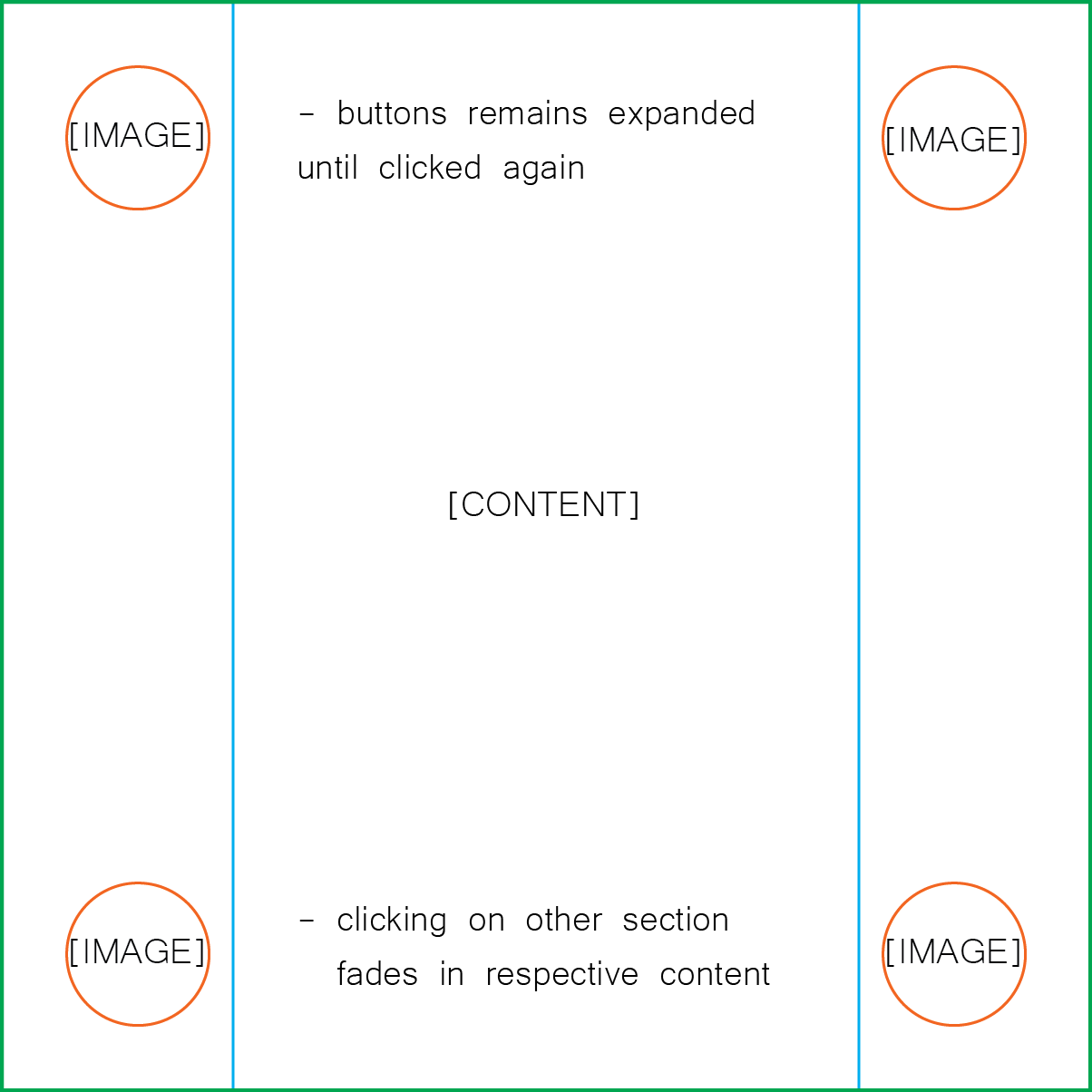
I quickly realized that I was losing a lot of space with the window frame design and that I should be treating the entire screen as the window frame. I also didn’t like the idea of having a default section already open. It felt like a step was missing or that it wasn’t obvious that the buttons were to be clicked. I decided to make the buttons have 2 states: an initial retracted state and a final expanded state. This gives the site a nice minimal design like the original Node design and allows the user to ‘enter’ the site. Once expanded, the buttons can be clicked and the previous content will be faded out and corresponding content faded in.
Originally supposed to be a simple, single paged photography portfolio, the site slowly evolved into a more comprehensive portfolio of some of my work and skills. Covering everything from frontend and backend developments, UX/UI design, and server configuration, this proved to be a big first step into web development. After a couple of months and countless hours, I had achieved the minimal design I set out for as well as a place to share my story and work.